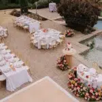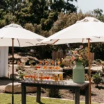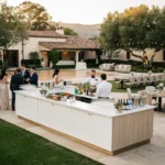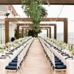

Autumn event design in Santa Barbara does not need to rely on burnt-orange tablecloths, artificial leaves, or a conventional harvest theme. Fall celebrations across the region often take place in Spanish-style courtyards, private estates, garden venues, coastal properties, historic spaces, and vineyard-inspired settings. Each location already has its own materials, colors, and natural character.
The most effective linen plan begins with those surroundings. Terracotta tile, warm stucco, weathered wood, stone patios, mature greenery, ocean views, and changing evening light can all influence which colors and textures feel appropriate. Linens should support these features rather than cover them with a seasonal palette that could belong to any location.
Ventura Rental Party & Events offers linen collections that range from soft woven neutrals to polished solids, printed designs, napkins, and runners. These options can be coordinated with tables, chairs, china, glassware, flatware, chargers, and décor to create a complete table setting suited to the venue.
When selecting autumn linen rentals in Santa Barbara, the goal is not to find the most obvious fall color. It is to build a palette that belongs to the property, responds to the event’s level of formality, and remains cohesive as the celebration moves from daylight into the evening.
Let the Santa Barbara Setting Define the Fall Palette
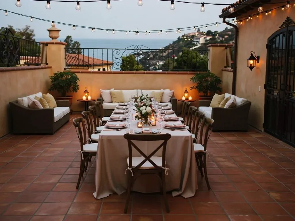
Before comparing fabric swatches, planners should study the venue itself. Permanent architectural features and natural surroundings provide a more useful starting point than a list of seasonal color trends.
A warm neutral may complement a detailed courtyard where tile and ironwork already provide visual interest. A deeper linen color may help define a table against an open lawn. At a coastal property, a light foundation with one grounded accent may feel more appropriate than a completely dark fall palette.
Start With the Venue’s Permanent Materials
Look at the colors and finishes guests will see around the tables. These may include:
-
Stucco or plaster walls
-
Terracotta roofing and floor tile
-
Decorative Spanish tile
-
Stone patios and fountains
-
Dark wood doors, beams, and furniture
-
Black or aged-metal ironwork
-
Garden greenery
-
Dry grasses and vineyard tones
-
Sand, sky, and coastal views
These elements should help determine whether the linens need to blend into the environment or provide controlled contrast.
For example, a courtyard with patterned tile, carved wood, and dense landscaping may already have several visual focal points. A natural, ivory, latte, or cream linen can keep the table polished without competing with the architecture.
A wide estate lawn offers a different challenge. Light neutral linens may blend too closely into the surrounding space, while a richer olive, aubergine, turmeric, or warm brown can give the dining area greater definition.
Reference the Season Without Creating a Literal Theme
Santa Barbara’s fall landscape is subtler than the bright foliage commonly associated with autumn in other regions. The palette can still feel seasonal without relying on pumpkins, leaves, or identical shades of orange across every table.
Venue-appropriate fall colors may include:
-
Adobe
-
Clay
-
Sienna
-
Turmeric
-
Muted gold
-
Wheat
-
Cocoa
-
Olive
-
Moss
-
Aubergine
-
Vintage grape
-
Natural ivory
-
Latte
These shades connect with Santa Barbara’s architecture, gardens, vineyards, and late-afternoon light. They communicate warmth through material and tone rather than through themed decorations.
Decide Whether the Linens Should Blend or Contrast
There are two effective approaches to venue-led linen design.
The first is to blend the linens with the setting. Natural, ivory, latte, wheat, sage, khaki, and soft olive can create a quiet foundation that allows flowers, china, glassware, and architectural details to stand out.
The second is to create contrast. Aubergine, indigo, charcoal, turmeric, sienna, cocoa, or deeper green can define the tables against a pale courtyard, open lawn, or light tent interior.
The decision should reflect the intended visual hierarchy. If the venue or florals are meant to carry the design, quieter linens may be appropriate. If the tables need to create stronger structure within an open setting, a more noticeable color or texture may be the better choice.
Build a Spanish-Courtyard Palette From Tile, Stucco, and Ironwork
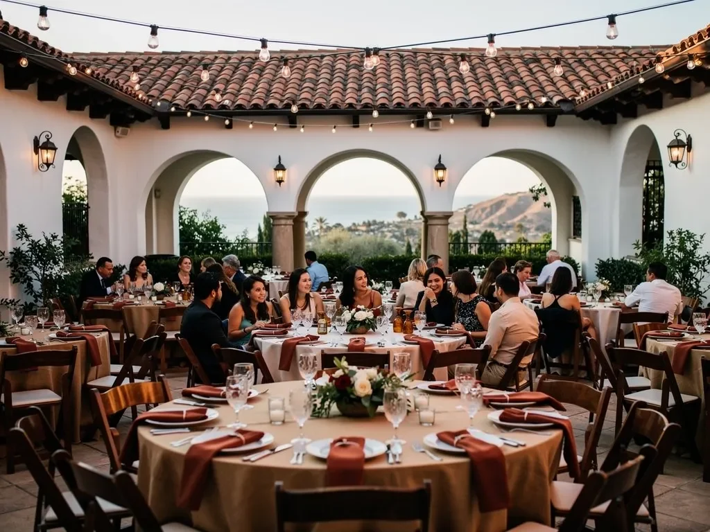
Spanish-influenced architecture is one of Santa Barbara’s most recognizable design characteristics. Arched openings, warm plaster, red tile, decorative floors, dark wood, and ironwork already create a layered visual environment.
Linens for these venues should feel connected to the architecture rather than placed over it. This often means using warm neutrals as the base and reserving stronger colors for napkins, runners, or selected specialty tables.
Use Warm Neutrals as the Foundation
Natural and cream-colored linens can complement warm stucco and terracotta without making the setting feel overly monochromatic.
Suitable directions may include:
-
Cambria Natural
-
Cambria Latte
-
Ashley Woven Ivory
-
Jute Natural Ivory
-
Lamour Vanilla Cream
-
Lamour Butter Creme
A woven or lightly textured neutral can be particularly effective in a courtyard because it provides subtle surface interest while allowing patterned tile, architectural details, and floral arrangements to remain visible.
These colors also transition well into the evening. Under warmer lighting, they can take on a softer tone that feels appropriate for dinner without appearing too formal during an afternoon cocktail period.
Add Adobe, Turmeric, or Sienna as a Controlled Accent
A Spanish-style setting can support richer colors, but they do not need to appear on every surface.
Options such as Cambria Adobe, Cambria Turmeric, Lamour Sienna, Lamour Pumpkin, or Lamour Plateau Gold can be introduced through:
-
Napkins
-
Runners
-
A sweetheart table
-
A cake or dessert table
-
A welcome display
-
Selected cocktail tables
Using these tones selectively creates depth without making the room feel heavily themed. Adobe can echo warm walls and tile, turmeric can connect with candlelight and brass details, while sienna can introduce a deeper earth tone that works well after sunset.
Use Patterns Only When They Complement the Architecture
Patterned linens can work beautifully in Santa Barbara, but detailed architecture already supplies visual movement. A print should not compete with decorative tile, carved doors, or elaborate ironwork.
Casablanca, Moroccan, lattice, stripe, check, and toile-inspired designs may be better suited to one controlled area rather than every dining table. A patterned linen can distinguish a welcome table or specialty display while the main tables remain more restrained.
When the floor or walls already contain a strong pattern, a solid or woven cloth will often create a more balanced result.
Soften a Garden or Estate Reception With Woven Texture
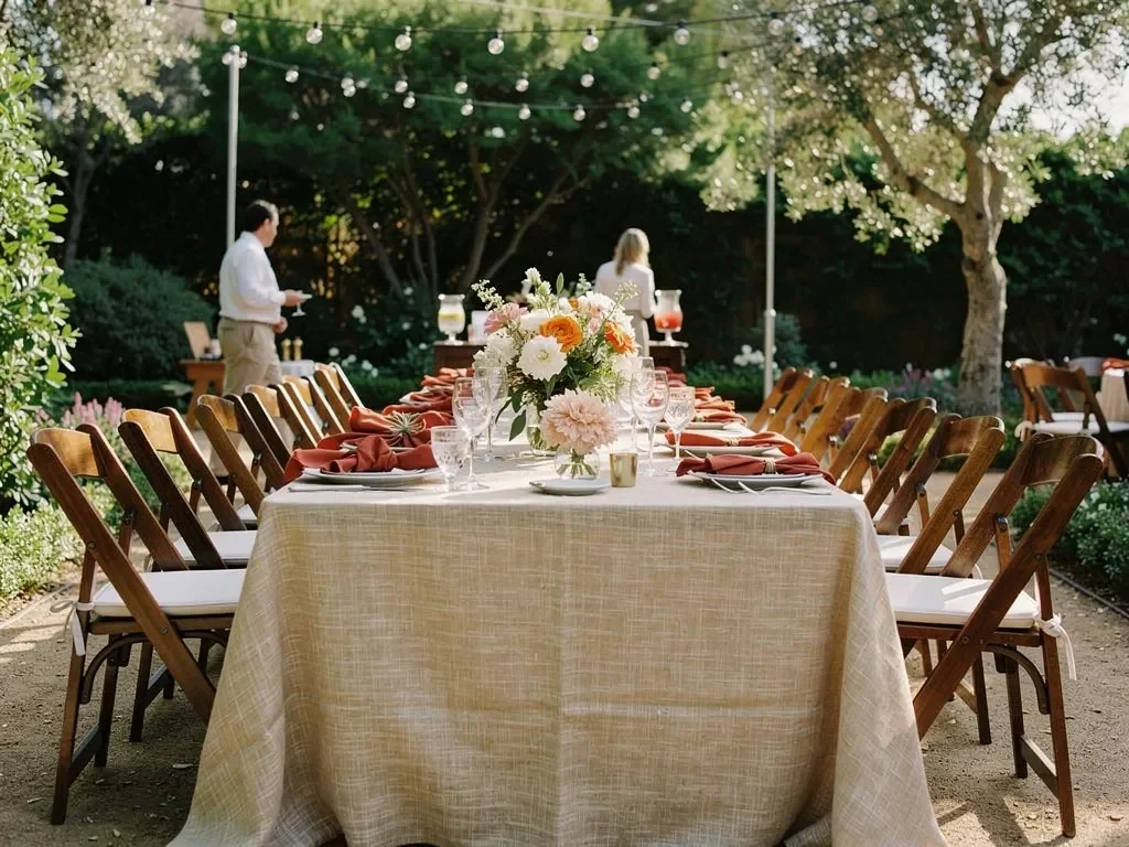
Garden venues and private estates contain their own mix of lawn, mature trees, floral color, stone, wood, and changing natural light. Linens can add softness and definition, but they should not overwhelm the landscape.
Ventura Rental has used Natural Cambria Linen at the Santa Barbara Club, pairing it with Capri Folding Chairs, Eleanor Indigo china, and Classico glassware. The result demonstrates how a restrained linen foundation can support a garden setting while allowing the tabletop and surrounding property to provide character.
Choose Natural and Woven Linens for a Relaxed Foundation
For estate lawns, private gardens, and landscaped courtyards, natural textures can feel more connected to the setting than highly reflective or overly formal fabrics.
Possible options include:
-
Natural Cambria
-
Ashley Woven Ivory
-
Ashley Woven Khaki
-
Ashley Woven Sage
-
Jute Wheat
-
Jute Olive
A woven texture introduces dimension without requiring a strong print. It can also help the tables feel substantial within a large outdoor space.
Natural ivory and wheat work well when the landscape or florals contain several colors. Sage and olive can create a quieter connection with the garden, particularly when balanced by lighter china, warm wood, or cream florals.
Pull Accent Colors From the Actual Landscape
Rather than selecting orange simply because the event takes place in fall, look at the property’s planting, floral direction, and surrounding landscape.
Potential accents may include:
-
Moss
-
Olivino
-
Aubergine
-
Deep blush
-
Mustard
-
Victorian gold
A garden filled with dark foliage or late-season greenery may support aubergine or muted gold. A property with softer flowers and pale stone may work better with deep blush, wheat, or moss.
This approach makes the palette feel specific to the venue rather than based on a standard seasonal formula.
Prevent Green Linens From Disappearing Into the Landscape
Green linens can be effective outdoors, but several similar shades may cause the table to blend into the lawn and surrounding foliage.
When using olive, moss, or sage, introduce contrast through another element. This may include:
-
Ivory or cream napkins
-
Wheat-colored runners
-
Gold or warm-metal chargers
-
Clear or lightly colored glassware
-
Aubergine floral accents
-
Natural wood chairs
The objective is to maintain a relationship with the landscape while keeping the table visually defined.
Keep Coastal Fall Linens Light, Layered, and Grounded
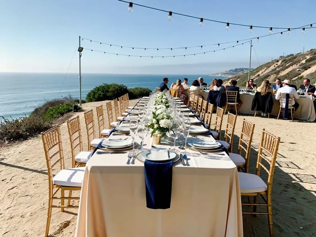
A coastal event does not need to become dark or heavy simply because it takes place in autumn. Ocean-facing properties, rooftops, and coastal estates often benefit from lighter palettes that preserve the openness of the setting.
Fall can be introduced through texture and one deeper accent rather than through an entirely saturated color scheme.
Begin With Sand, Natural Ivory, or Soft Taupe
A light foundation can connect with stone, sand, wood, and coastal architecture.
Possible linen directions include:
-
Cambria Natural
-
Cambria Latte
-
Ashley Woven Ivory
-
Ashley Woven Khaki
-
Jute Natural Ivory
-
Lamour Vanilla Cream
-
Lamour Mocha
These shades allow the ocean, sky, and property to remain part of the design. They also provide a versatile background for colored glassware, darker napkins, or warmer floral arrangements.
Introduce Autumn Through One Deeper Color
A coastal fall palette can gain depth through one carefully selected accent, such as:
-
Aubergine
-
Indigo
-
Moss
-
Sienna
-
Turmeric
-
Vintage grape
Indigo can connect with the coastal setting while feeling richer than a summer blue. Aubergine introduces seasonal depth without relying on red or orange. Turmeric can add warmth to a neutral table, particularly as daylight fades.
Using one principal accent also makes it easier to coordinate the linen plan with china, glassware, flowers, and signage.
Avoid Generic Nautical Styling
A Santa Barbara coastal setting does not require anchors, shells, navy stripes, or other obvious motifs. The location can be acknowledged more effectively through natural materials, open views, a light foundation, and restrained color.
The linen design should feel appropriate beside the water without becoming a themed interpretation of the coast.
Use Richer Linen Tones for Vineyards and Ranch-Style Properties
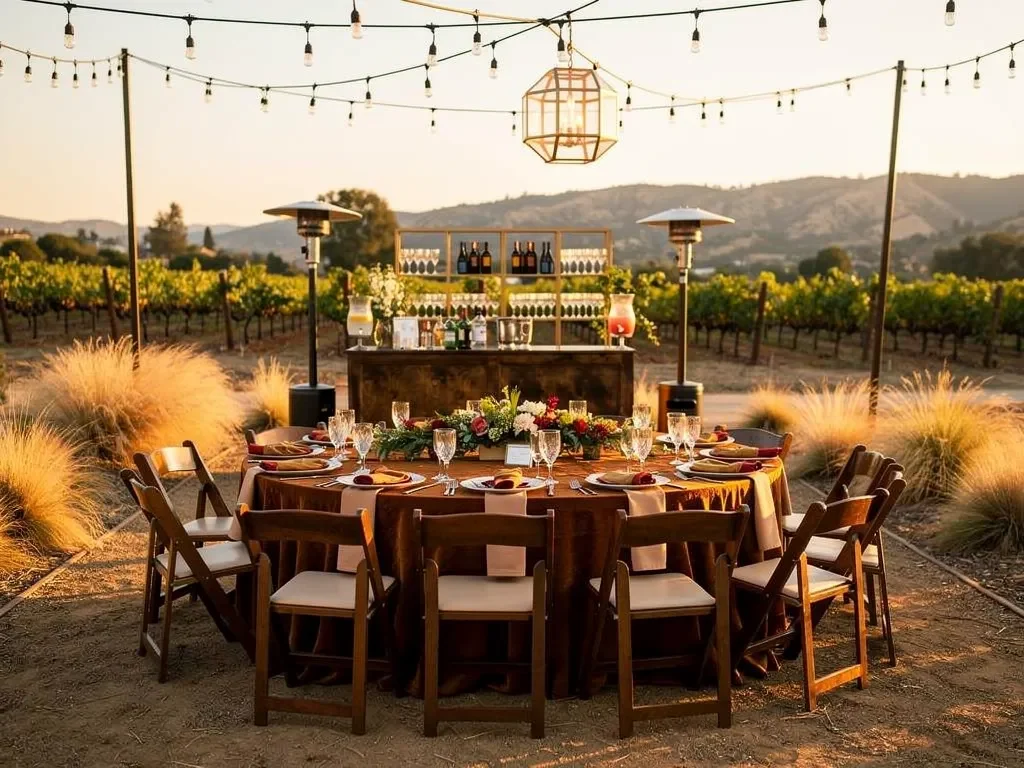
Vineyard-inspired and ranch-style properties can accommodate richer colors and heavier texture. Wood, stone, dry grasses, open land, and warm evening light create a setting where cocoa, wheat, olive, aubergine, and gold can feel natural rather than overly dramatic.
Ventura Rental serves Santa Barbara County and the Santa Ynez Wine Country, making these settings an important part of the regional design landscape.
Build the Base With Wheat, Cocoa, or Natural Linen
Colors such as the following can connect with wood tables, landscape tones, and stone:
-
Cambria Cocoa
-
Cambria Natural
-
Jute Chocolate
-
Jute Wheat
-
Ashley Woven Khaki
-
Lamour Mocha
A wheat or natural linen can keep the event relaxed and light, while cocoa or mocha can create a stronger evening foundation.
The best choice depends on the amount of natural wood already present. If wood tables, chairs, beams, and flooring are all visible, a lighter linen may create needed contrast. If the setting is pale or open, a deeper cloth can help anchor the dining area.
Add Depth With Aubergine, Olive, or Gold
Richer accent tones can support the vineyard or ranch setting without creating a novelty rustic theme.
Options may include:
-
Lamour Aubergine
-
Lamour Moss
-
Lamour Olivino
-
Lamour Plateau Gold
-
Lamour Victorian Gold
-
Cambria Turmeric
Aubergine and vintage grape can reference vineyard surroundings without becoming literal. Olive and moss connect with natural greenery, while gold and turmeric can reflect dry grasses and late-afternoon light.
Decide When to Leave Wood Tables Visible
Not every table needs a full cloth. A finished wood table may be better served by a runner, napkin-led palette, or carefully selected tabletop pieces.
Leaving part of the table visible can be appropriate when:
-
The wood finish is an intentional design element
-
The property has a relaxed or natural character
-
The tabletop pieces provide sufficient visual structure
-
A runner can connect the table to the wider palette
-
Full coverage would make the design feel too formal
A full linen may still be preferable when tables vary in finish, when the design requires stronger color, or when a more formal reception style is desired.
Choose the Linen Finish According to the Event’s Formality
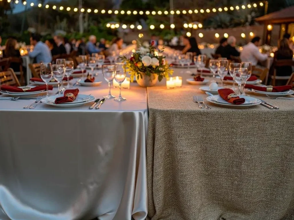
Two linens in similar colors can produce very different results when their textures and finishes differ. The surface of the fabric helps determine whether the table feels natural, polished, romantic, or formal. We cover this further in Tableware and Linens: Enhancing Corporate Dinner Experiences.
Ventura Rental’s linen families allow planners to select both color and finish according to the venue and event style. You may also find Linen & Tabletop Style Guide for Ventura Weddings helpful.
Use Cambria and Woven Collections for Natural Texture
Cambria, woven, and jute-inspired linens can suit: For more detail, see our article Quality Linens: A Must for High-End Event Aesthetics.
-
Garden receptions
-
Spanish-style courtyards
-
Private estates
-
Coastal dinners
-
Vineyard-inspired properties
-
Relaxed outdoor celebrations
Their texture adds depth without requiring a busy print. These collections are particularly useful when the setting contains organic materials such as stone, wood, greenery, or woven furniture.
Use Lamour for a Smoother, More Formal Finish
Lamour linens provide a more polished surface and are available in a wide range of neutral, green, gold, red, purple, and orange tones.
They can work well for:
-
Formal evening dinners
-
Wedding receptions
-
Sweetheart or head tables
-
Specialty displays
-
Tented celebrations
-
Tables requiring a richer solid color
A Lamour cloth may also create useful contrast within a natural setting. For example, a smooth aubergine specialty table can stand out against woven neutral dining linens without leaving the overall palette.
Reserve Prints for Defined Focal Areas
Printed linens have the strongest effect when they are assigned a clear purpose.
Consider using a print on:
-
A welcome table
-
A guest-book table
-
A cake or dessert table
-
A gift display
-
A limited number of cocktail tables
-
Another specialty area
Dining tables can then use a coordinated solid or woven linen. This creates hierarchy and prevents the design from feeling visually crowded.
Test the Palette in Santa Barbara Light
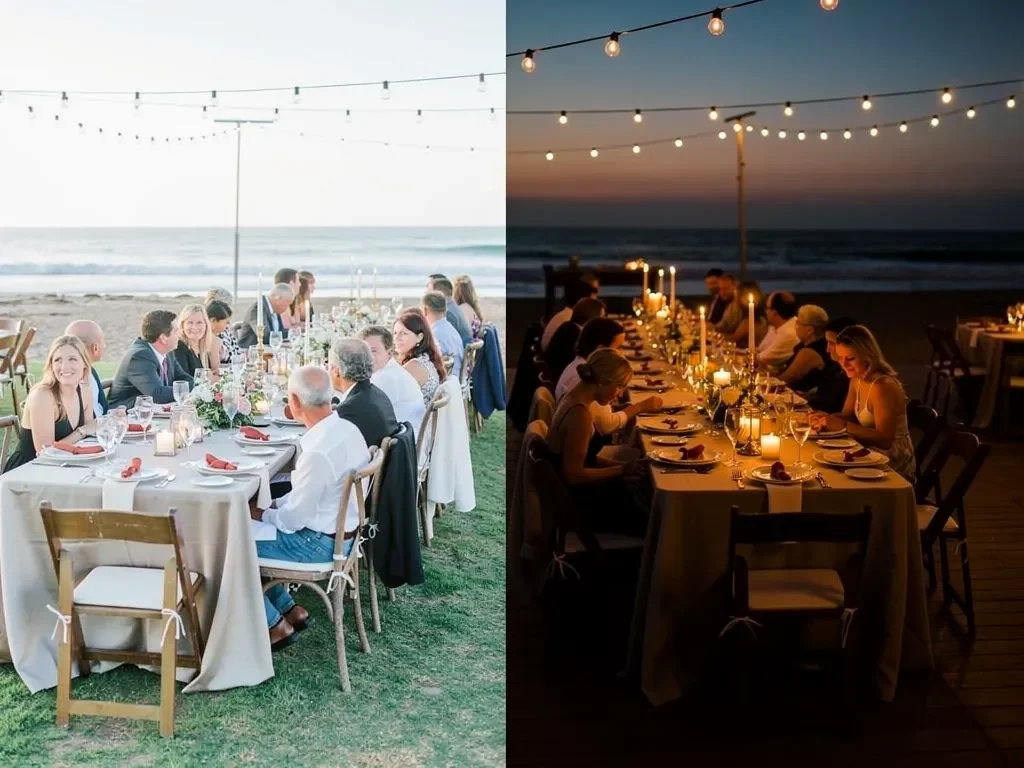
Linen colors can appear different when viewed on a screen, beneath showroom lighting, in direct sun, or under evening illumination. Outdoor events also move through several light conditions during the same day.
A final linen decision should account for the time and place in which guests will see the tables.
Review Colors in Direct Sun and Open Shade
Bright daylight can make pale linens appear lighter and reduce the apparent depth of darker colors. Open shade may bring out cooler undertones that were less obvious indoors.
When reviewing possible colors, consider whether the tables will be:
-
In full afternoon sun
-
Beneath trees
-
Inside a courtyard
-
Under a clear or opaque tent
-
Beside a light-colored wall
-
Surrounded by dark greenery
A cream linen may appear almost white in strong sun, while a deep color may feel softer outdoors than it does indoors.
Recheck the Palette for the Evening Portion
As natural light fades, warm lighting can enrich cocoa, turmeric, aubergine, sienna, and gold. Cooler lighting can change the appearance of white, ivory, blue, and green fabrics.
The palette should work for the entire event rather than only the afternoon setup. This is especially important for receptions that begin outdoors before sunset and continue through dinner.
Compare Linen Samples With the Actual Tabletop
A linen should not be approved in isolation. Review it alongside the selected:
-
China
-
Chargers
-
Flatware
-
Glassware
-
Floral colors
-
Table finish
-
Chair style
Ventura Rental’s inventory includes linens alongside complete tabletop and furniture rentals, making it possible to evaluate how the pieces work together.
A linen that appears plain by itself may become the correct foundation once patterned china and colored glassware are added. A dramatic fabric may become excessive when paired with several other detailed elements.
Use Accent Linens Without Overdesigning the Table
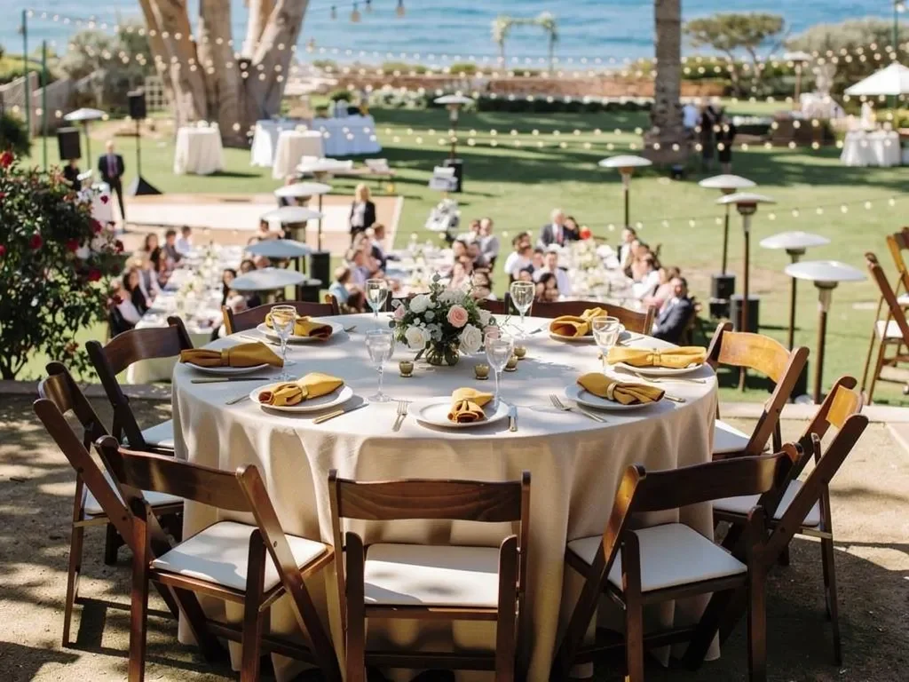
A layered table does not need to use every available fabric. The base linen, napkin, runner, flowers, and tabletop pieces should each contribute something distinct.
The strongest designs establish a clear hierarchy rather than giving every element equal visual weight.
Choose One Primary Linen Color
The primary cloth should establish the overall direction and connect the dining area to the venue.
It may be:
-
A natural woven neutral
-
A warm cream
-
A deeper olive
-
A polished aubergine
-
A muted gold
-
A soft taupe or latte
This color should work across the main dining tables and remain compatible with the surrounding property.
Add One Supporting Accent
A napkin or runner can introduce contrast or connect the table to the floral palette.
Ventura Rental’s napkin and runner collection includes options such as:
-
Deep blush
-
Mustard
-
Ivory
-
Villa Stripe Red
-
Natural runners
-
Oatmeal hemstitch
-
Woven textures
-
Other specialty pieces
A natural linen with a mustard napkin can create warmth without turning the entire table gold. A deeper aubergine napkin can ground an ivory table in a garden setting. A patterned runner can add interest to a wood table while leaving most of the finish visible.
Let the Remaining Tabletop Provide Detail
China, glassware, chargers, flatware, and florals can supply the rest of the texture and color.
Avoid combining all of the following without reviewing the full setting together:
-
A strongly textured cloth
-
A bold printed runner
-
A saturated napkin
-
Patterned china
-
Colored glassware
-
Elaborate florals
One or two focal elements will usually have more impact than several competing details.
Carry the Linen Palette Across the Event Selectively
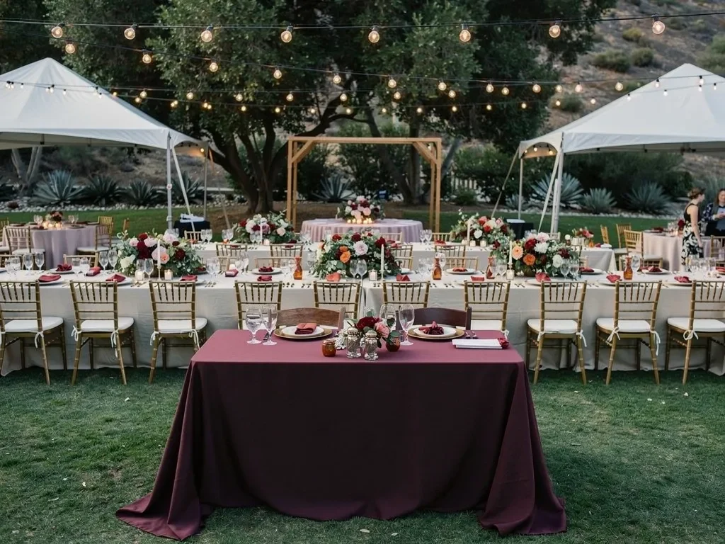
A cohesive event does not require every table to use the same linen. The palette can remain consistent while different areas receive slightly different treatments based on their purpose.
This creates visual structure without making the setting feel overly uniform.
Keep Dining Tables Visually Consistent
Dining tables should establish the dominant linen direction. They may all use the same base cloth or a controlled combination planned around table shape and function.
Consistency across the dining area creates order, particularly in gardens, courtyards, and tented spaces where the surroundings already contain visual variation.
Give Specialty Tables a Defined Role
A sweetheart table, cake table, welcome table, or display may use:
-
A deeper shade
-
A different texture
-
A print
-
A contrasting runner
-
A more polished linen finish
The change should still belong to the main palette. A specialty table should look intentional rather than as though it was designed separately from the rest of the event.
Avoid Covering Every Rental in the Same Color
Bars, cocktail tables, buffets, service stations, and display pieces should be evaluated individually.
Some rentals have finishes that are meant to remain visible. Others may need linen to integrate with the event or conceal operational equipment.
Using the same cloth everywhere can flatten the design and cover materials that would otherwise add useful contrast.
Prepare the Linen Order Around the Actual Table Plan
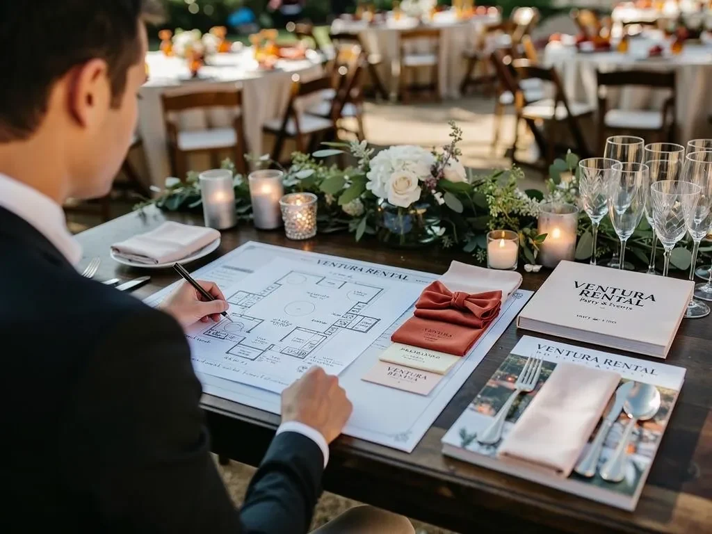
The final linen order should be based on confirmed tables and event zones, not simply on the total number of guests.
Table shape, dimensions, height, desired coverage, and intended use all affect the correct linen selection.
Confirm Every Table That Requires Linen
Review the full event plan and identify:
-
Dining tables
-
Cocktail tables
-
Sweetheart or head tables
-
Cake and dessert tables
-
Welcome and guest-book tables
-
Buffet and service tables
-
Display tables
-
Any tables used by vendors or staff
Not every table needs the same treatment, but each one should be accounted for.
Match the Linen Size to the Table and Desired Drop
The correct linen size depends on:
-
Table shape
-
Table dimensions
-
Table height
-
Desired drop
-
Whether the legs should remain visible
-
Whether the table will be used for dining, display, or service
A cocktail table may need a different coverage style from a dining table. A specialty table may use a full drop for formality, while a wood table may use a runner or partial treatment.
Sizes should be confirmed against the selected rental tables rather than estimated from a general chart.
Confirm Colors, Quantities, and Assignments
Before the rental order is finalized, review:
-
Linen collection
-
Color
-
Size
-
Quantity
-
Table assignment
-
Napkin or runner accent
-
Coordination with china and glassware
-
Indoor or outdoor placement You may also find Summer Wedding Reception Linens: Indoor vs. Outdoor helpful.
-
Any specialty table treatment
This final review helps prevent a selected color from being applied to the wrong table type or an accent linen from being omitted from the order.
Frequently Asked Questions
Which linen colors work best for a Santa Barbara fall event?
There is no single fall palette that works for every venue. Spanish-style properties may suit adobe, turmeric, cream, olive, or sienna. Garden settings may work well with natural, wheat, sage, moss, aubergine, or muted gold. Coastal properties often benefit from lighter neutrals paired with one deeper accent.
The venue’s architecture, landscape, natural light, florals, and tabletop selections should guide the final choice.
Does Ventura Rental carry linen colors suitable for autumn?
Yes. Ventura Rental offers Cambria, woven, jute, Lamour, printed, polyester, Shantung, napkin, and runner collections. Available directions include natural, latte, wheat, adobe, turmeric, cocoa, olive, moss, aubergine, pumpkin, sienna, and gold tones.
Availability should be confirmed for the event date, required sizes, and quantities.
Should every table use the same linen?
Dining tables should feel coordinated, but specialty tables may use a different shade, texture, runner, or print within the same palette.
This distinction can help a sweetheart table, welcome display, or cake table stand out without making the event feel disconnected.
Are dark linens appropriate for an outdoor Santa Barbara event?
Dark linens can work well, particularly for evening receptions, vineyard settings, ranch-style properties, or selected focal tables. The decision should account for natural light, venue materials, tableware, floral colors, and the desired level of contrast. For more detail, see our article How to Layer Textured Linens for Your Fall Receptions.
A dark cloth may be especially effective against pale stone, light tent interiors, or open lawns.
How should linens be selected for a breezy outdoor property?
Share the venue layout, table types, level of exposure, and event schedule with the rental team. Fabric selection, table coverage, napkin placement, and tabletop pieces should be coordinated around actual site conditions.
Lightweight decorative pieces should not be added without considering how they will remain secure.
Can linen samples be coordinated with other table rentals?
Yes. Ventura Rental offers linens alongside tables, chairs, china, glassware, flatware, chargers, and décor. Reviewing these pieces together makes it easier to compare color, texture, finish, and scale before the complete rental order is finalized.
What details are needed when requesting linen rentals?
Provide:
-
Event date
-
Santa Barbara venue or property
-
Table plan
-
Table shapes and dimensions
-
Required quantities
-
Event style and level of formality
-
Preferred colors
-
Selected china and glassware
-
Floral direction
-
Indoor, outdoor, or mixed setting
-
Event start and end times
These details help the rental team recommend a linen collection and palette suited to the actual event.
Design the Fall Palette From the Santa Barbara Setting
The strongest autumn linen rentals in Santa Barbara do not begin with a generic list of seasonal colors. They begin with the property.
A Spanish courtyard may call for warm neutrals with adobe or turmeric accents. A garden estate may benefit from woven natural linens, wheat, moss, or aubergine. A coastal property may remain light and open while using one deeper color for seasonal definition. A vineyard or ranch-style setting may support cocoa, olive, gold, and richer texture.
Ventura Rental Party & Events offers Cambria, woven, Lamour, printed, Shantung, polyester, napkin, and runner rentals, along with coordinated tables, chairs, china, glassware, flatware, chargers, and décor. With decades of experience serving Southern California events, the team can help align the linen plan with the venue, table layout, event timing, and overall design direction. To check availability for your date, reach out to our rental team.
Share the Santa Barbara venue, confirmed table plan, event schedule, and preferred aesthetic with Ventura Rental Party & Events to begin selecting a fall linen palette designed for the setting rather than imposed upon it. See tablecloths, runners and napkins in our linen rentals.